

Publications
Essay By Donna Tennant + Henry Hunt
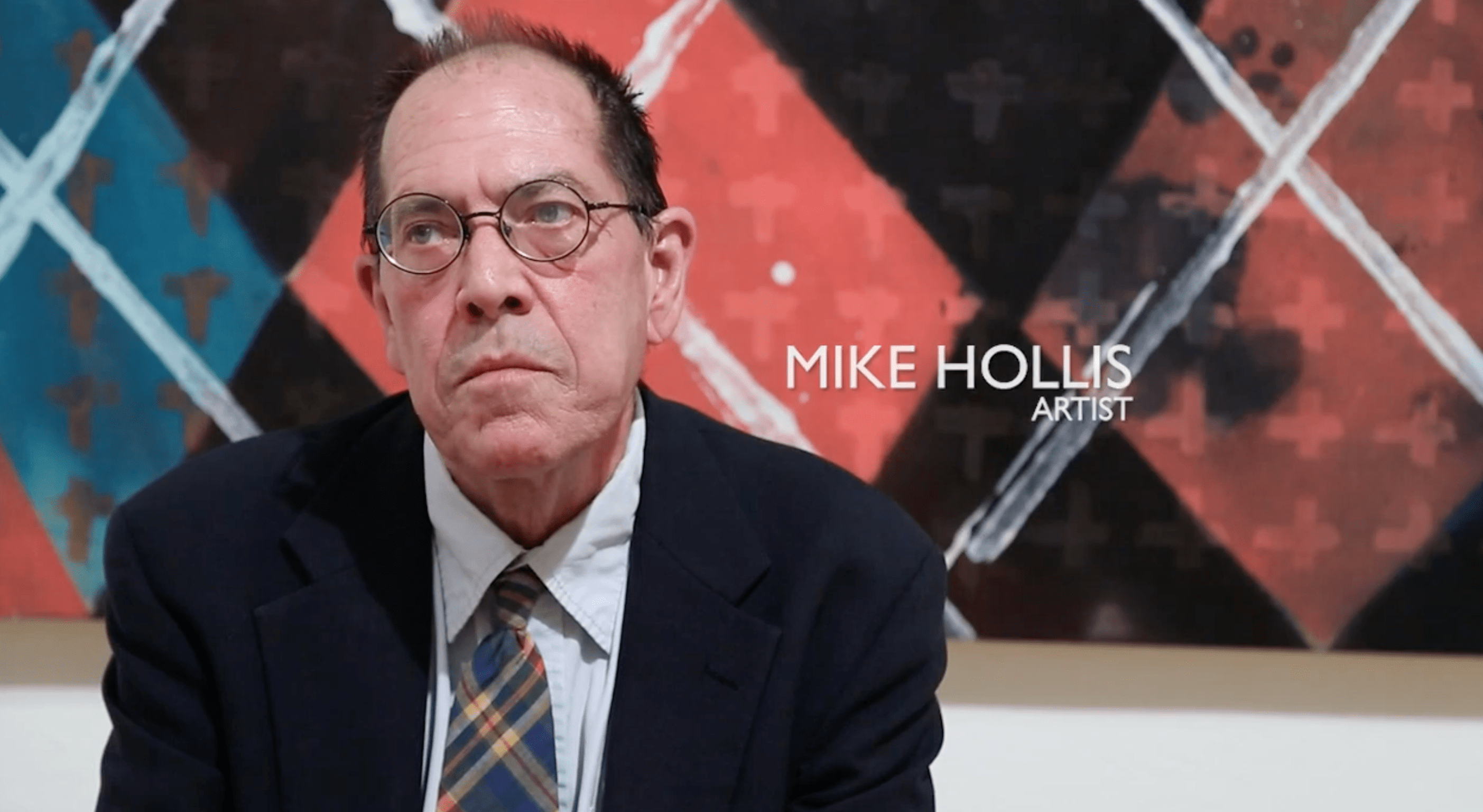
Mike Hollis is a classic modernist. Hollis believes in the sensibilities of modernism, and his work is a testament to it. His paintings reveal, without exception, fidelity to an aesthetic that rejects representation in favor of pure abstraction. The result is reductive and non-objective. He utilizes a familiar nomenclature of shapes and colors in the tradition of geometric abstraction, arranging squares, rectangles, parallelograms, and other polygons to achieve seemingly endless variations.
Hollis has been part of the Houston art scene since the mid-1970s. After studying at the University of St. Thomas, he went on to work at the Contemporary Arts Museum of Houston, where he remained for eight years. The exposure to a broad range of contemporary art in the museum’s galleries had a fundamental influence on the course of his work. From the beginning, he had little interest in representational or figurative art. His allegiance to formal abstraction began at this time, and he has continued on this path for nearly half a century. Hollis embraces a pictorial language of nonrepresentational forms, avoiding the narrative in favor of spatial and color relationships.
After experiencing early success in the 1980s with one-person exhibitions at Texas Gallery and 55 Grand Street in Manhattan, among others, his solo and group shows have become less frequent. He has been included in significant exhibitions, notably “Degrees of Separation” (2015) curated by James Harithas at The Station Museum of Contemporary Art with Mel Chin and other artists. Throughout his practice, Hollis has experimented with complex patterns and collage, as seen in the significant Argyle series, several examples of which were shown at The Station. It remains a continuing interest. In the series of small paintings titled Sanduku, he establishes a pattern of geometric shapes in which the basic structure is repeated with nine variations, each with different color relationships. His color combinations are critical, with several of the cruciform shapes sinking into a black background, while others emerge from pale gray to blue to a dark mottled ground.
Typically, he works in series of three, six, or nine paintings, but he is not slavish to this formula. There are exceptions to this system as seen in the current exhibition.
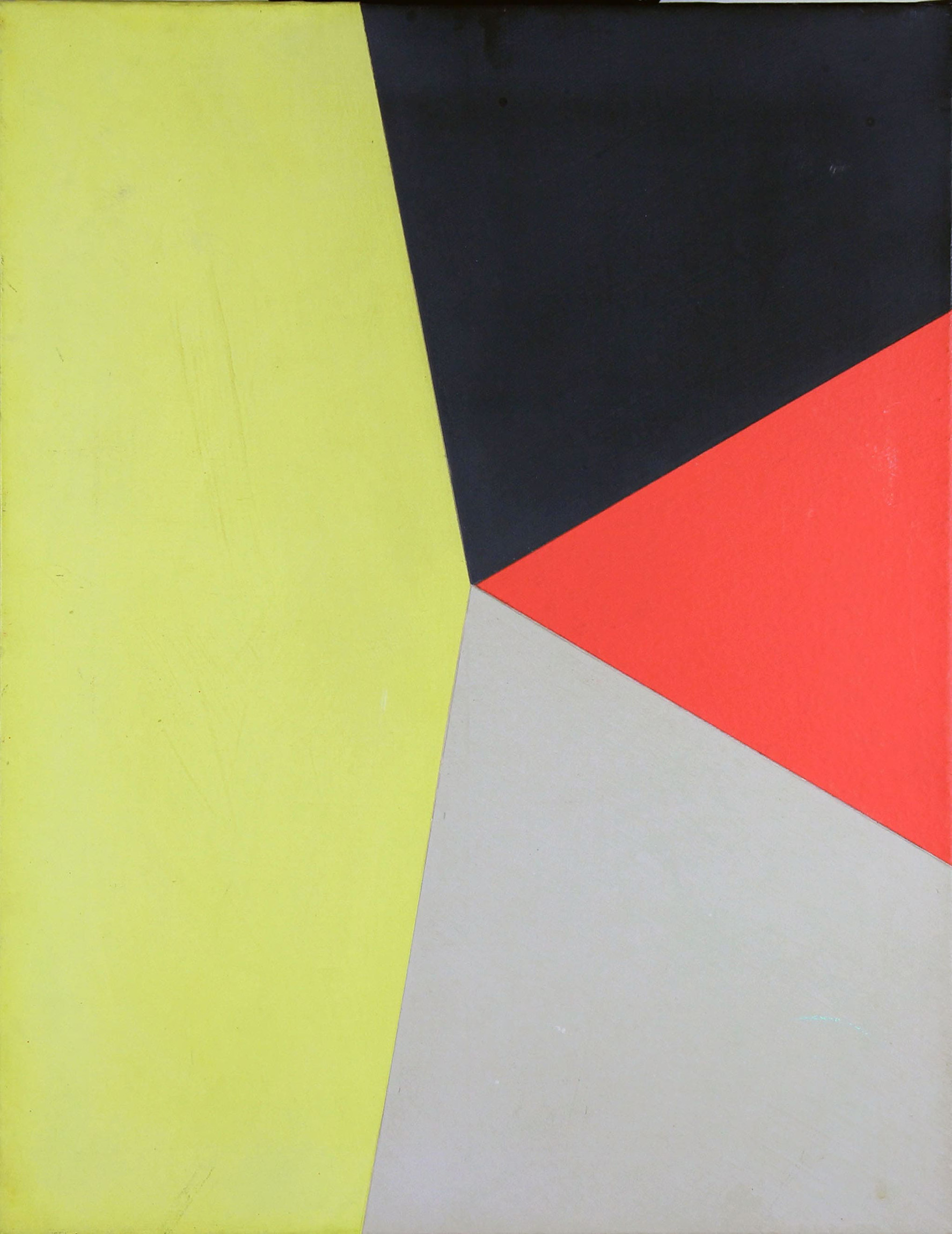
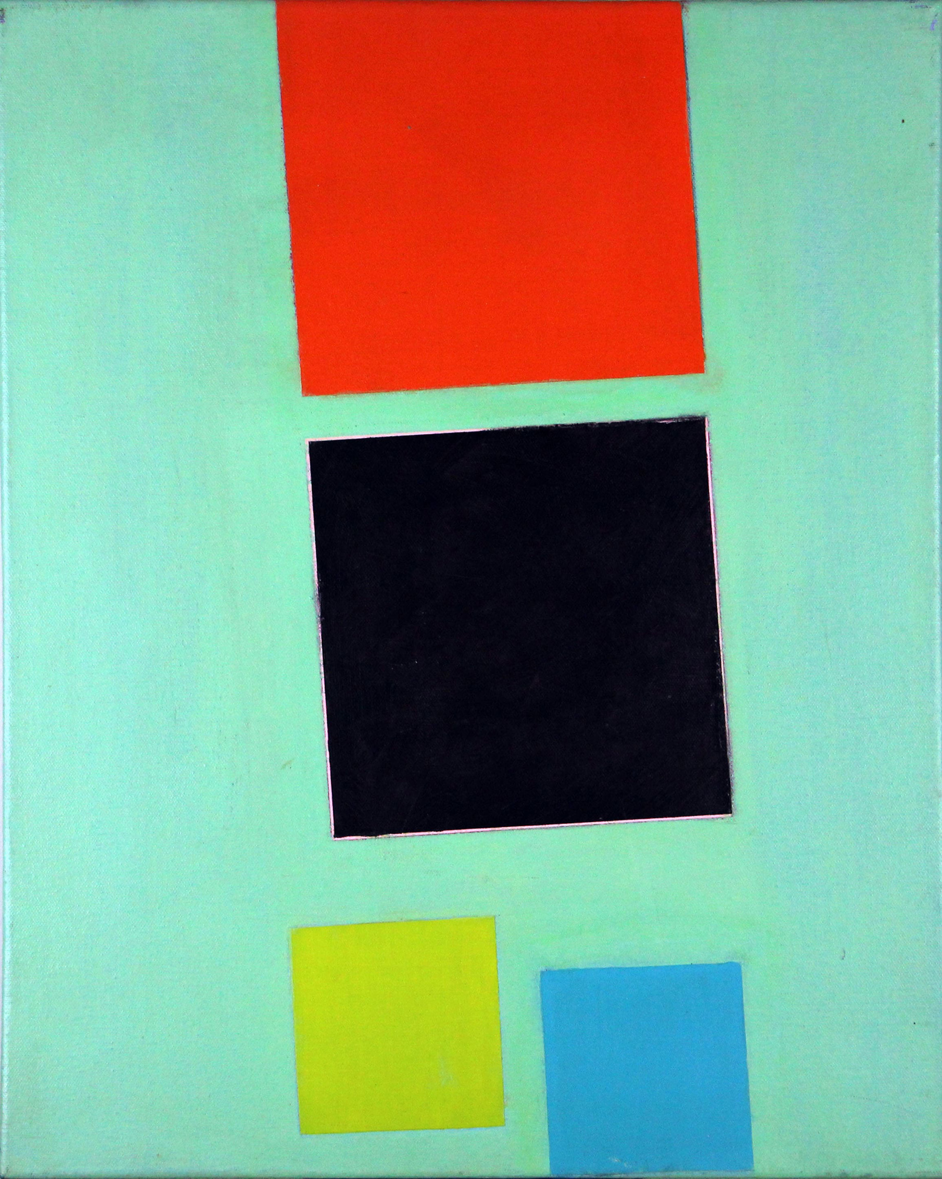
Color is an essential element in Hollis’s paintings. Color brings motion and energy to the pieces, as seen in Pillow Filler (a). The black square on the flat red ground implies an urge to spin, but two pointed shapes seem to restrain it by simply touching opposite corners, thereby creating palpable tension. A companion piece Pillow Filler (b) offers a color variation with the black square hovering over a turquoise ground executed with visible brushstrokes. A magnetic attraction seems to exist among these three elements. The Bindle series suggests a three-dimensional static space, alluding to corners of rooms with colored walls, while Congo Drops evokes windows and doors. In contrast, the congo b series presents shapes that appear to float within the picture plane.
Congo b (c) is a departure within the series, with a right angle of white paint outlining the orange square.
The edge of a dark-green shape dry- brushed with black suggests a layering of forms, as does the white stripe above it.
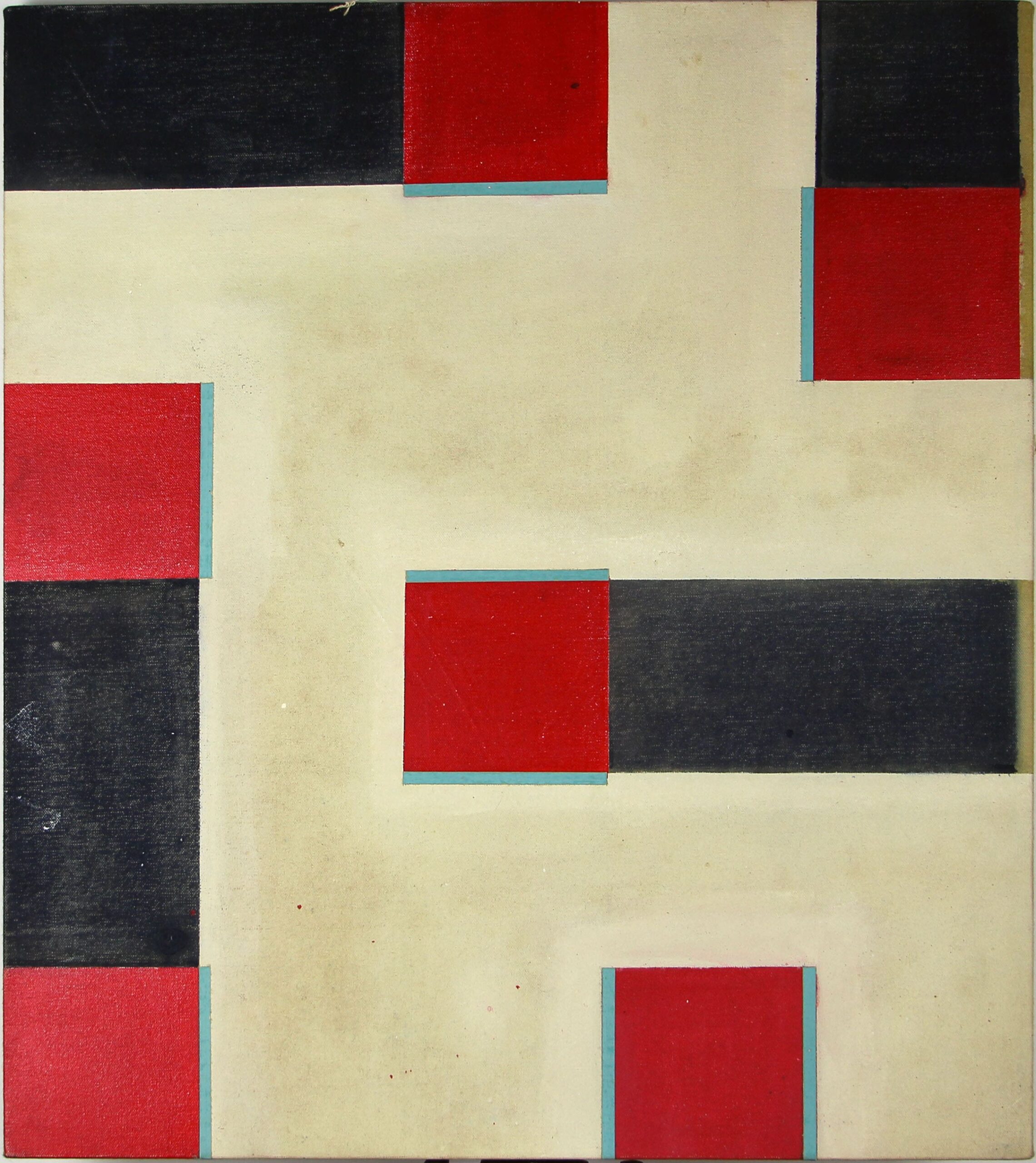
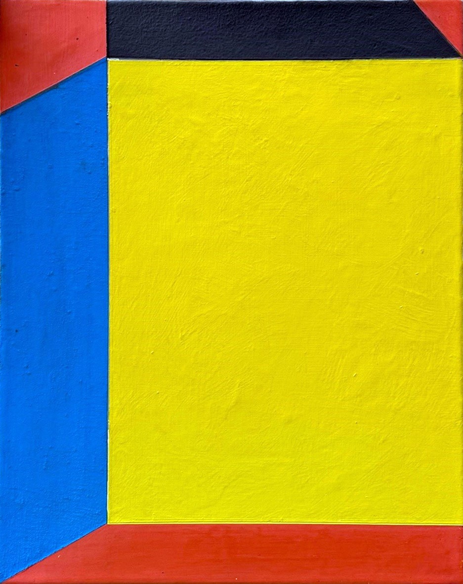
Although Hollis uses tape when painting, the edges of his forms are often imprecise, as one color encroaches into another. These minor imperfections are not of great concern to him, as he prefers to concentrate on more crucial issues and move on to the next permutation. Then there are the anomalies. In Trafficante red squares bordered by blue stripes are attached to black rectangles and become totem-like forms that push into the picture plan from all sides. Flyer uses a similar palette but introduces acute and obtuse angles to his geometric forms. The red square has become the side of a three- dimensional benchlike shape, while two skewed turquoise rectangles intersect to suggest a river or the sky. Hollis’s palette is never somber, and these relationships between form and color create energy. In contrast to some non-representational art, his paintings exude a tempered vitality. To a sensibility that often renders itself “cool,” he brings an expressive vigor.
Hollis reduces his imagery to the essentials, and the greater the simplicity, the more clarity and purity there is in his paintings. If modernism is the reduction of external connotation in the service of universal forms, Hollis is an authentic modernist. He adheres to the canon of geometric abstraction, exploring the relationships among shape, color, and line.
He understands composition and spatial organization, as well as equilibrium and opposition. Using a combination of playfulness and restraint, Hollis demonstrates control over his forms, colors, and surface textures. The recent work presented in this exhibition illustrates Hollis’s evolution as a masterful and compelling painter.
Mike Hollis, Psychedelic Punk by Tex Kerschen
Americans lust after pictures of horses, landscapes, and people’s faces, offset by supersaturated fields of rich, spiritual blue, but most of them would rather die than admit it. Abstract painting may leave many of them dry, twisted, and unsatisfied, but that’s what they trade online; that’s what they sell and buy in galleries. Abstract painting looks good with furniture. It suggests a cosmopolitan, knowing perspective.
However, the suggestion of a cosmopolitan worldview and the appearance of discernment are not the same as those things themselves. You have to know things. You can’t go around not knowing things.
Hollis is a painter’s painter. But, really, he’s a painter for anyone with an eye and a mind for beauty. His paintings ooze pleasure and intelligence. They are not sentimental. They don’t beg for your attention; they reward it.
“When the legend becomes fact,” John Ford famously said, “print the legend.” So here it is.
Hollis was one of the first psychedelic punks. He dropped out of high school, spent time with the Red Krayola and its entourage, the Familiar Ugly, and taught himself and Julian Schnabel how to paint and how to surf. He quit his studies at the University of St. Thomas to work at the CAMH.
Not enough could ever be said about the acuity of his eye for color and form, but he’s got an ear for what is lively in music too. He saw the Sex Pistols in London, saw Prince’s first concerts in Houston. Hollis was on hand for most of Houston’s legendary moments. And then love stepped in, spiriting him away to New York to meet his destiny.
But something happened.
SCREEN MEMORIES mean the false memories the brain makes to shield trauma victims from reliving pain. To Hollis, SCREEN MEMORIES mean those good times on playback in the minds of those who have been abducted by aliens, probed, and thrown back into this catch-and-release stock pond Earth.
At various times in his career as an artist, one whose works can stop you in your tracks, Hollis has stood at the brink of the abyss of success, looking deep into it before saying, No, thank you in his gracious southern twang.
He is a true believer when it comes to painting. Like a monk, but with wit. Whatever he does, whatever he has done, he has always been in league with an unnerving beauty. But this agonizing nearness to beauty in its forms does not dilute easily. He once crawled across the pine floorboards of the Menil Collection to prostrate himself at Agnes Martin’s feet, calling her “Master” until museum security asked him to leave.
Hollis makes paintings like big harsh tabs of color that come on like LSD. And what colors! LSD is not a friendly trip. LSD is a death ride, not a consolation. The panes of color in these paintings aren’t weak medicine. Taken through the eye, they intensify space and time.
Or maybe I’m mistaken and Hollis is easy listening, and his paintings are furniture- adjacent, Muzak for the eyes.
No, no, I’m not. They’re not.
This is joy wrapped around trauma. These are violent visitations, recollected in tranquility.
Station Museum
Mike Hollis is a decades-long devotee of geometric abstraction, using techniques and strategies generally attributed to post-minimalism. Having mastered this approach he has also found ways to give each work a radical new meaning while imbuing it with calculated emotions. Through carefully crafted assemblages, photos of recognizable patterns with collaged objects suspended in resin mimic post-painterly abstractions while retaining their objective existences. Corporate aesthetics and its emphasis on streamlined form is deconstructed and reconstructed with scratches and vibrant colors. The result is a distinctive product of Contemporary Art.

Mike Hollis
AWARDS
2016 Houston Press - Best Artist
BEST OF HOUSTON®
ARTS & ENTERTAINMENT
In the interest of hastening and possibly short-circuiting the delay between total obscurity and posthumous renown (see Forrest Bess, Henry Darger and that Dutch guy who cut off his ear), let us praise Mike Hollis, one of the most original and committed painters Houston has produced, still living here and still working. His paintings —always changing, always ahead of the pack — are consistently engaging and strangely likable lozenges of hard, funky abstraction with a pop-color palette and a wordless wit. Over the course of his career he's shown at Texas Gallery and the Station Museum, not to mention in New York and elsewhere. Let the record state that he was also a one-time member of the Red Krayola's Familar Ugly mega-band, a psychedelic hooligan and an early punk, an artist's artist dedicated to the whole enchilada, an emblem of the anarchy and chaos for which Houston has prided itself all these years.